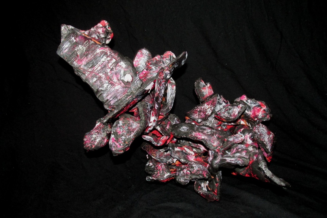
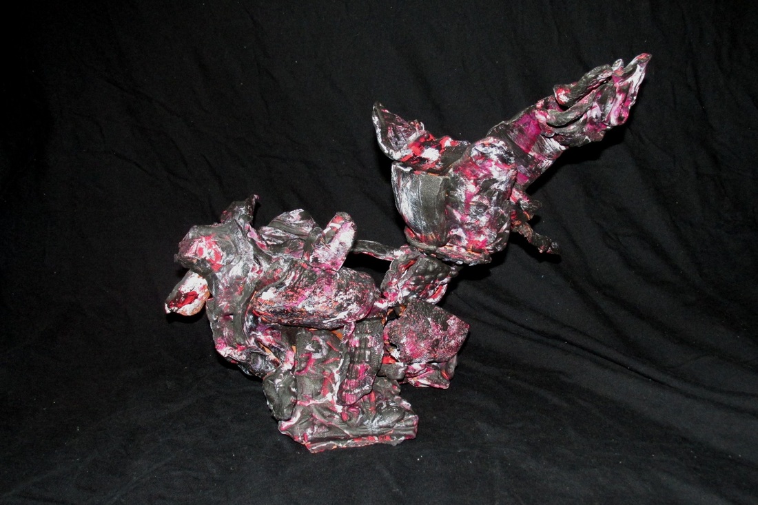
  For this project, each student made multiple pieces of red clay with different shapes, patterns and textures. These pieces were all fired and then each of us were to make a sculpture using these pieces that others have created. This made for a more instinctual approach to the sculpture rather than building it from the ground up with what it means and how it'll look. Omitting the pre-planning process (sketching, etc.) of creating this sculpture was a really interesting and new method to me, and I found that it pushed my creativity by creating this limitation. I used 3 different paints, red, white and black, and painted along the edges of the pieces as well lightly brushing over them so the paint only caught the most superficial surfaces, visually enhancing the potpourri of textures that appear among the individual components of the sculpture.
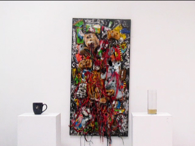 Above is the performance itself. I didn't go as well as I would have ideally liked it to, but given the experimental nature of this whole project, this is something I expected. Ideally I wanted everything (except close up shots of the canvas) to be symmetrical, and this symmetry was broken once I brought the cup to the foreground. Other than that, the whole process was simple and worked well. I added some transitions and different camera angles to keep the whole video visually interesting and to not be monotonous. There were some happy accidents, such as my body staying in the middle between the two pedestals as I grabbed for the basin, and that added to the whole contrast of the scene and made it even more interesting to look at. The black thermal I wore as well added much more of a visual "pop" then I originally thought it would, so that was nice. 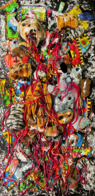 First part of the final. Stuffed animals from my childhood (as well as a stuffed book), cut up and sewn into canvas along with yarn, coffee grounds, acrylic gesso, and black paint. above are concepts of the canvas and a general storyboard. All steps were followed in the storyboard, but I also added additional scenes in the video itself, such as the closeup view of the canvas, the perspective panning up the canvas, and the closeup shot of the basin with the dirty water dripping in it. This has been the most experimental piece of art I've ever done. During the course of this project, I really wanted to expose myself to techniques and new ways to portray objects while also integrating film. Nearly everything the final product is made of is symbolic, and I wanted to convey what the overall idea was without any explicit details within the work itself, I wanted the art to speak for itself. The whole process involved sewing cut up stuffed animals into canvas, then attaching yarn with hot glue, and then used coffee grounds distribute throughout with rubber cement and acrylic gesso. Black paint was also used to intensify the look the coffee grounds gave. I then filmed in gallery 10, the act of me pouring a pot of hot water over the top of the canvas and letting the water filter through the intricacies of the piece, picking up anything it can in its path, and ending up in a glass basin beneath the canvas. This was then poured into a tall glass and then brought into the foreground. The amount of water that ended up in the basin wasn't nearly as much as I would have liked or nearly as dirty I as I would like, but nonetheless I got dirty coffee water.
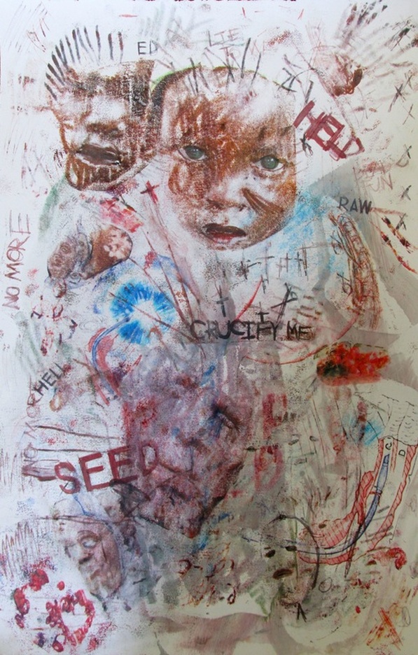
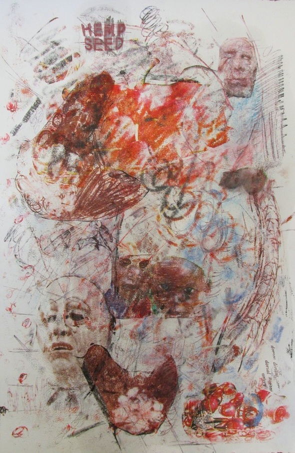
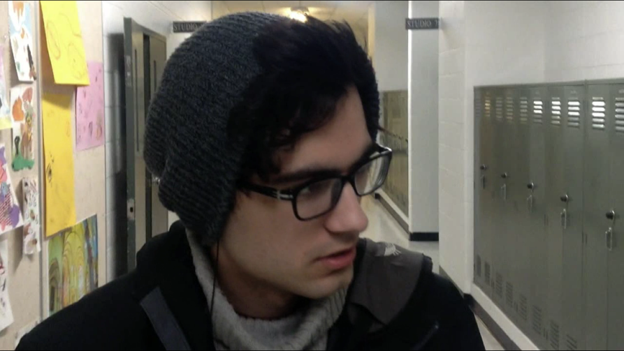
Before I get into the details, the overall idea of this piece is memory and retention, especially at that of an older age when we start to forget more and more of our past, masked over by recent experiences. With that said, the piece is composed of stuffed animals from my childhood. They're cut up and some have their faces inside-out for a more macabre effect. The fact that they're cut up represents the sparseness of memory and that we don't always remember events in their entirety unless we search out each piece of that memory. In regards to arrangement, the cut up pieces were arranged to what I thought was visually interesting, they weren't arranged chronologically or in any other fashion other than strictly visual. The stuffed animals altogether represent my past. Yarn was used to express neural connections but also acted as a more intricate space for the hot water to filter through. Different colors were used to compliment the different colored animals as well as, again, to make the overall piece much more visually dynamic and interesting to look at. The colors could also represent a "colorful" past, full of different experiences and events, and noticed how it's masked over, but not entirely, by coffee grounds and black paint. The used coffee grounds represent modern me. I drink tons of coffee and it's become a really important factor during my first year here at Siena, and I've been collecting coffee grounds since the start of the winter semester, so just like the stuffed animals, they've been used. They're dark, practically black, and this is in clear contrast to the colorful yarn and animals. The coffee grounds and black paint represent recent memory and what I have become accustomed to. Mostly everything nowadays for me is routine and nothing too exciting, the complete different to when I was a kid when I was exposed to tons of new experiences and everything was interesting to me, expressed by the color. Color altogether plays a major role. As I've mentioned, the range of actual color seen in the piece represents my childhood experiences/childhood in general, and the black represents recent experience and recent memory. Notice in the video that I'm wearing black all over, black pants, black thermal, black glasses. This is to further accentuate the modern "John", or what I am now. The mug I'm holding is also dark (not black, although it would be ideally) and has the Siena emblem on it, and I'm drinking from it as I walk in, further reinforcing the idea that coffee is a part of my adult life in addition to the grounds on the canvas and pouring a coffee pot of hot water over the canvas. The height comparison of the Siena mug and tall glass is also important. The mug is shorter, representing recent memory, and the glass is taller, representing past memories and all my experiences (of course the height in relation to each other isn't exact in how they're proportionally related, but it gets the idea across). The finished product, the glass filled with the water filtered though the canvas, represents my current memory, but this can be applied to anyone. We all forget a lot about our past, but the personally important parts stick with us as (yarn, stuffed animal fur, etc.) well as some other events in which we don't know why we still remember them. I wanted to make sure as well that others could relate to this piece. Stuffed animals are almost always considered a piece of childhood, while it is generally agreed that older individuals drink coffee, so the distinction between the two can be uncovered and understood based on our cultural context for each of them. Overall, I'm proud of this project's outcome. It ended up working out a lot better than I initially thought given how different and experimental it is. I found it a good way to finish my first year in Siena's art program. Above is the unedited version of the video made for the class. No sound was added, so we just hear the sound the suit makes itself, the whole purpose of the assignment, while still delivering an abstracted message of some sort. Above is the edited version of the video. This was made to further get across the abstract message of the video, and was more so for fulfillment for me personally, not for the class. 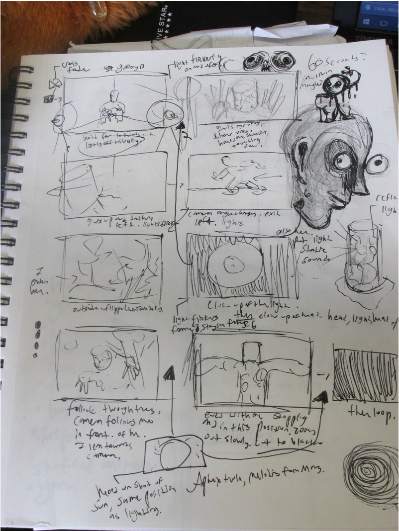 Here's the storyboard for the video, not followed strictly due to the 30 second constraint and my initial thinking that it was a minute long video. Originally, the video was to end with a symmetrical shot of the sun (which wasn't out that day) to replicate that of the shot of the light which did make it in the 30 second video. This was to show a visual similarity but difference between artificial and natural light/light sources. Also omitted was a shot of me leaving the seat to them leave the gallery 10 room. Only shown in the video was me leaving gallery 10 in the odd walking fashion, or as my friends have called it, the "shimmy". |
|||||||||||||||||||||||
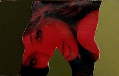
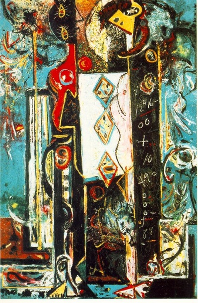 Pollock's "Male and Female" (1942)  Pollock's "Pasiphae" (1942) | 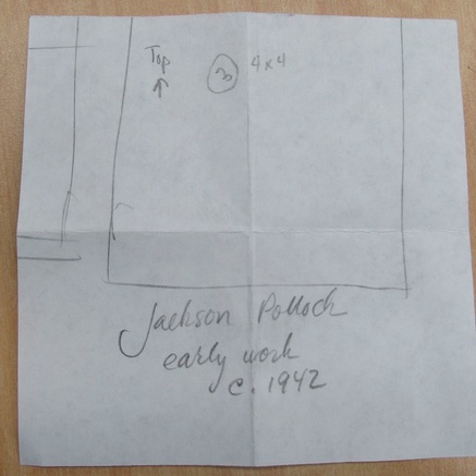 Assigned artist was early Jackson Pollock. 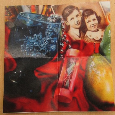 1/4 of Flack's "Marilyn" I had to recreate in early Pollock's style. |
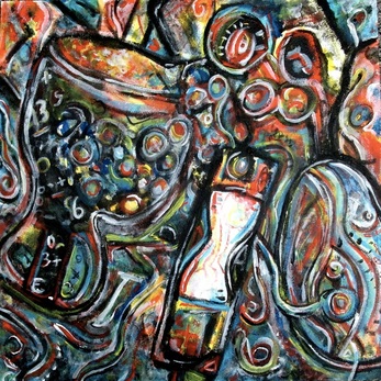 Initially, this was what the finished product was. After looking at it for awhile, I noticed how it really didn't capture Pollock's style too well, and replicated more of the way I work. | 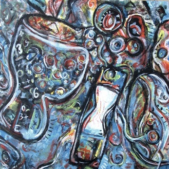 Here is the finished product. Notice where areas that use to be of more complexity are dulled down. I did to achieve a more prominent focal area. I also used more dry brush dabs with white and light blue. |
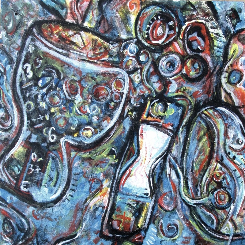
I found this project to be interesting in that you become much more keen on identifying an artist's particular style when trying to replicate, and all their work just becomes much more interesting. For my rendition, I wanted to take into account the abstracted sexual imagery and the decorative swirls found in the paintings. I added dry brush dabs onto the canvas the replicate those found in "Male an Female", as well as using mathematical calculations to show man. Quick and rough brush strokes, especially with outlines, are also apparent in his early paintings, so I attempted to replicate that as well. In regards to sexual imagery in my painting, breasts can be identified, as well as a vulva where the larger pear is in the original Marilyn piece by Flack. Roundness and curviness is also applied throughout the piece to hint at the female body figure.
Overall I am content with the outcome. I feel I have captured Pollock's early style fairly accurately.
Overall I am content with the outcome. I feel I have captured Pollock's early style fairly accurately.
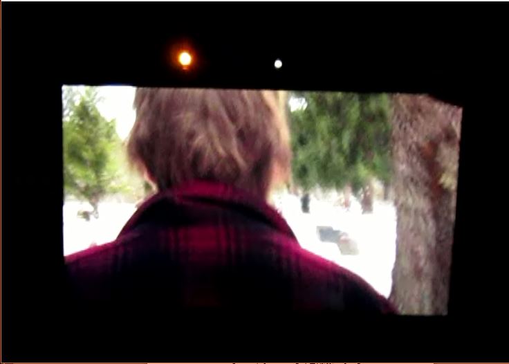    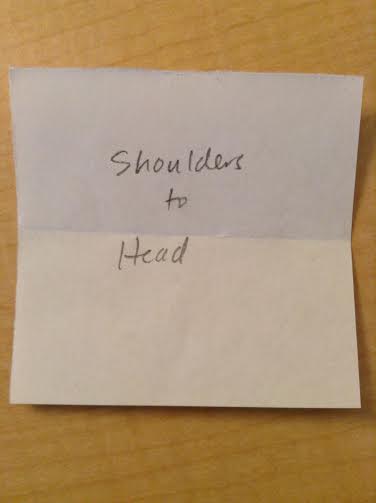 Our assigned section of the body to film 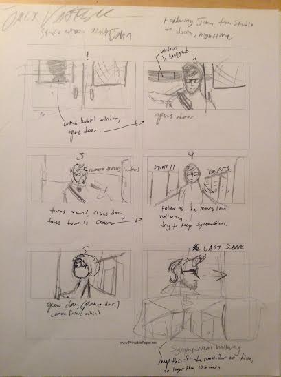 Storyboard 1 for Jack's video of me Originally, the camera was to start filming in front of the double doors of the painting studio, as I would come through them. Instead we found the painting on the wall adjacent to those doors to be very interesting and a good place to start briefly as it would look great symmetrically lined up. I still come through the doors, however and into the shot of this painting, and then the trailing begins as I walk down the hallway. | 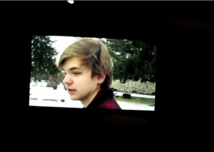 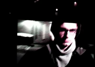 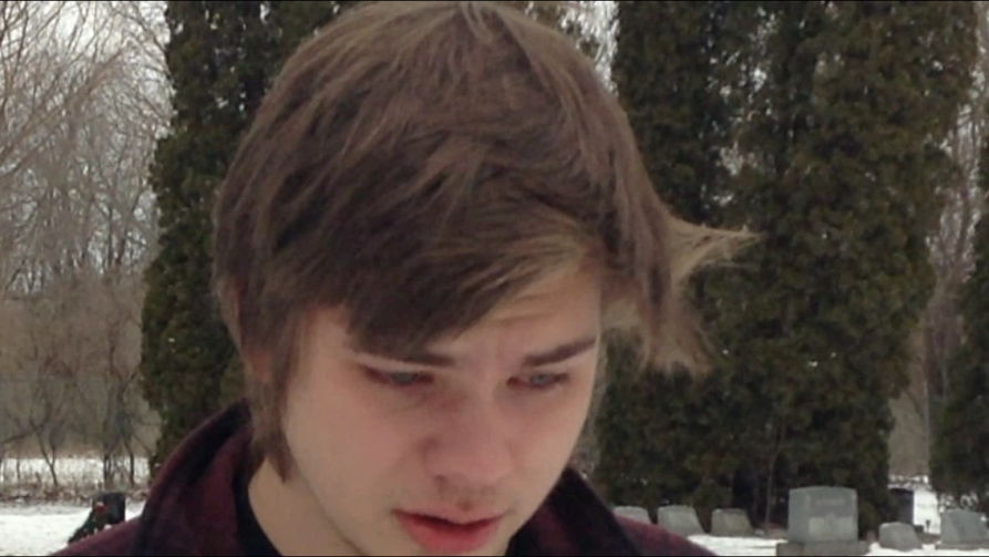 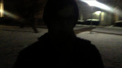 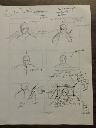 Storyboard for my video of Jack. We were originally intended to head back to my car within the Following, but we ran out of time. Originally, the film would have been comprised nearly entirely of a frontal shot of Jack as he paced throughout the graveyard, paying special attention to the ground. This, however, proved extremely difficult, as we couldn't fixate a linear, smooth walking pace that would make this possible. Instead, the original video resulted it me trailing behind Jack and to his side, still retaining the emphasis on the ground. 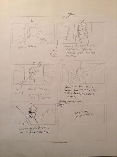 Storyboard 2 for Jack's video of me |
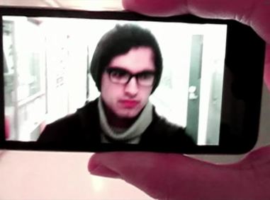
Our portion of the body assigned to us was the head and shoulders, and this led to some interesting ideas between me and my partner, Jack Van Tuyle (http://jackthomasvantuyle.weebly.com/). My 4 minute video is of me leaving the painting studio in Studio Angelico at night and heading to my dorm, a normal routine with a familiar setting. To make this video dynamic and interesting, a use of side and back shots were used, as well as walking in and out of different light sources. Changes made was we took an elevator instead of the stairs up to the 4th floor as we realized how time consuming and difficult it was to film me going upstairs while trying to keep my head and shoulders in view. We also decided that the video-in-video shooting would be during the daytime to present a heavy contrast between the two periods and light-intensities during the day.
There have been changes that deviate from the storyboard's intended progression. These are a result of trying to keep the camera steady while trailing around corners, and mostly moving at a pace that feels natural and smooth, which we failed at. Filming the front of somebody while the person filming walks backwards proved to be much more difficult. As a result, neither of us were able to finish where we originally intended since we had to walk slow enough so that the person behind the camera could smoothly trail along.
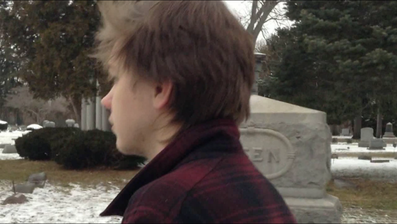
Jack's video, on the other hand, which only required a single 6 frame storyboard sheet to map out, is different. He decided that we wanted to be filmed at the cemetery in which his grandma is buried. What makes this particularly special is that this is the first time Jack has visited his grandma's grave since her passing. As a result, the video's main emphasis is on emotion and context. Jack becomes emotional during the beginning of the film, and from that point we don't get a front-head view of Jack for the remainder of the video, only back and side shots, which conflicts with what the original storyboard plan was, which was a constant frontal shot. Keeping Jack's full face out of shot adds emphasis to the ground, accented by Jack's natural movements, such as moving his hair, talking, and sniffing. There were undoubtedly faults on my part with shakiness and turning the camera, briefly putting Jack out of view, but I feel it to be further reinforcement on the environment around Jack, dark gravestones against snow. Another alteration is that we never made it back to my car in time as was originally planned in the storyboard.
The dynamic in my film of him is of evocative power, while his video of me holds power in the changing background, the changing film shots (side and back), and the changing light sources.
In the end, however, the entirety proved to be less than favorable. The far too many technical faults and manual faults while filming have lead to a piece that is lacking and nothing "exquisite" in my eyes. The bulk of this project that proved beneficial was the act of doing it all and experiencing it, not creating a note-worthy piece.
NOTE1: We noticed major difficulty when filming the video-in-video portion. Indoors, it was easy and as expected, but when outside, the reflection from the filming device (Canon Powershot camera) filming the I-pod touch (which filmed both of the followings) was seen in the reflection, along with the blur from natural light. What made the subject matter even more indistinguishable was that the camera would adjust the brightness based on the center object's darkness, which was the Ipod touch's black screen, so the ground was practically all white, making it non identifiable and extremely difficult to follow the same path the original video (following) took.
NOTE2: As of 2/21 Video in video filming was taken place indoors and outside at night so there was no glare or interference that would make the playback distorted or unidentifiable. Although the ground is nothing particularly interesting, the video plays clearly and smoothly, and, most importantly, the subject matter is apparent and clear.
| hannah_frost_happening.mp4 |
| john_bucher_1.mov |
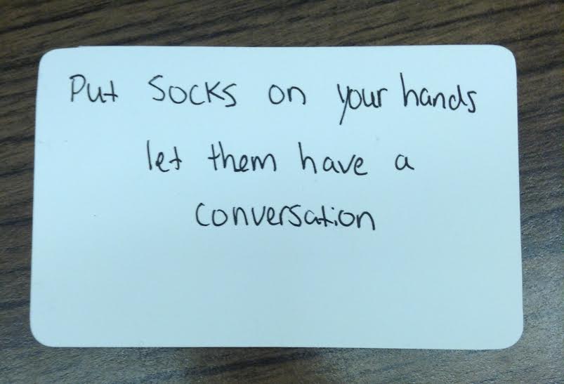
This action is the one to be performed by me for the 10 second animation.
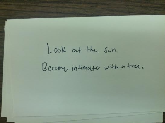 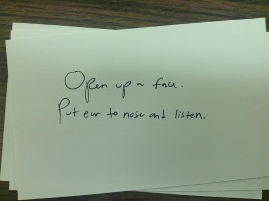 | 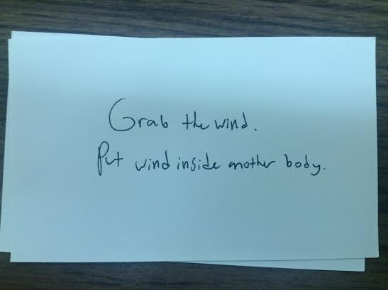 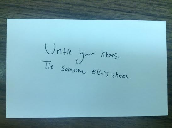 |
These 4 notecards are the actions I wrote down.
My experience with this project was better than I expected, although there were some great difficulties on my part. I found that working with an entirely new partner (Hannah Frost, and using light and shadow in interesting ways to be the most beneficial. Capturing an action or the "happening" within the time frame was also interesting, so we made sure that every frame held a specific purpose and wasn't wasted or meaningless to the whole. Difficulty arose when I took Hannah's video of her feeling the wall. I filmed it wrong in that her body was mainly on the left side of the video, which would be covered up as Mad and Peter described to us earlier. The contrast between light and shadow also wasn't too strong. So I took all 40 frames into my photo-editing program, flipped them all vertically and bumped up the contrast so that the difference was much more distinct. Then I took these new 40 frames into my video program and exported it into the video that is available at the top of this post. This is why it is an mp4. file rather than a mov. file. As a project I've never remotely done before, the experience was fresh and overall enjoyable. Working within the style of New Vision Photography was also interesting, and was something I would not have considered if I haven't been exposed to it. It opened the door to new and more interesting possibilities when filming an already obscure act.
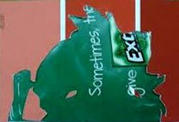  |   |
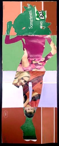
In this collaborative project, we cut out a human figure from a magazine, traced the outline of that figure onto a 4-folded piece of paper, and used a figure-ground relationship in which the figure (outline) was another image from a magazine, complimenting the ground (paint chips). What made this project interesting is that we work on other people's projects, so the end result was unpredictable. I found that working with complimentary colors and uncanny imagery was the most interesting, specifically seeing what other students used to make the image uncanny, and especially the end result of the exquisite corpse that I started (top image).
| art_105_historic_reinterpretation_artist_statement.docx |
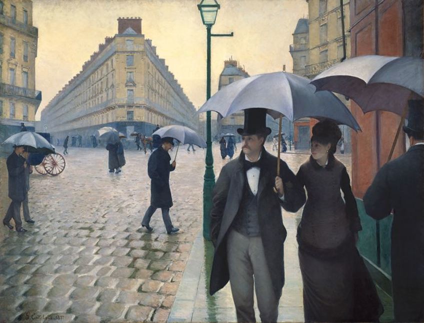
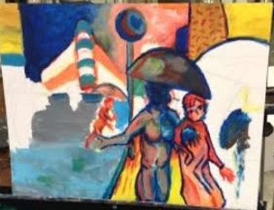
Gustave Caillebotte, "Paris Street; Rainy Day"
 Important here is the figure who's face is darkened out. One may interpret it as man or woman, which is key. However I went with a more feminine body figure as I progressed further to get a more streamline idea across since the majority of the piece is obscure and abstract. 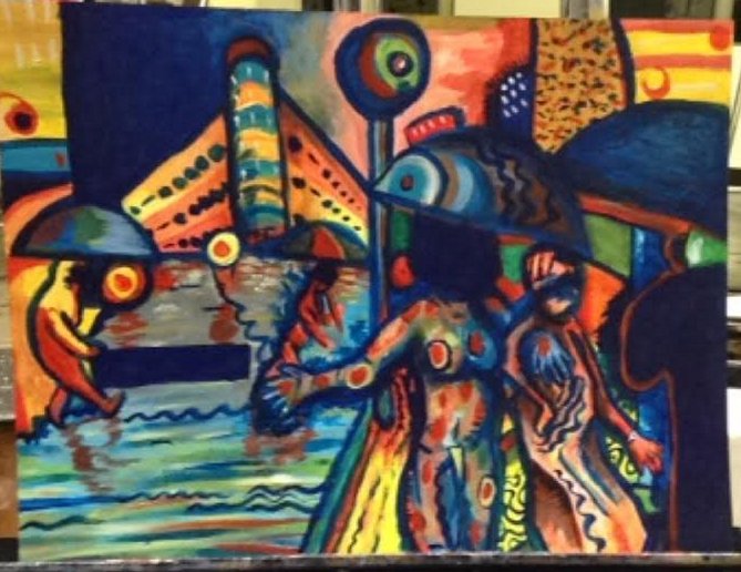 This is where I started implementing expressive line and coded communication, morse electric telegram messaging that reads "Lie". The wavy, uneasy lines are to represent an internal and mental discord. I didn't originally udnerstand the project's requirement, a fault on my part, so the creative strategies came late into the development of the painting, so the expressive lines aren't uniform throughout the painting, again, a fault on my part. They do serve a symbolic purpose however, I wanted to make sure of that for the sake of the piece itself rather than criteria (I have become emotionally attached to this work). | 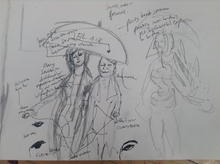 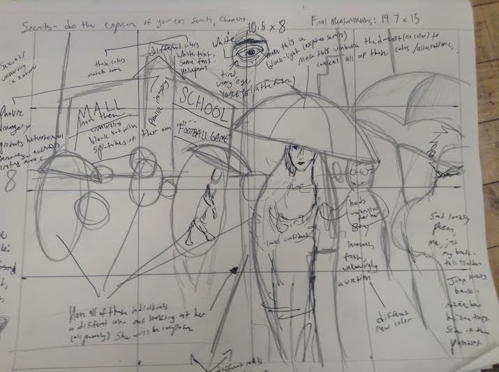 The initial concept was to be much more realistic, similar to the original piece. This however didn't get the idea I wanted across, so I turned to abstraction and obscurities. 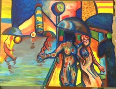 Here is where we see the effect of reflection. I liked how in the original painting it was raining, so I wanted to initially use reflection to show other people's "secrets". This idea quickly got thrown away before I elaborated with it as It came to me how cliche it was. 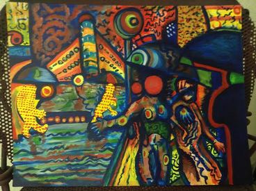 |
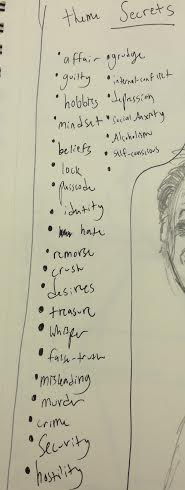
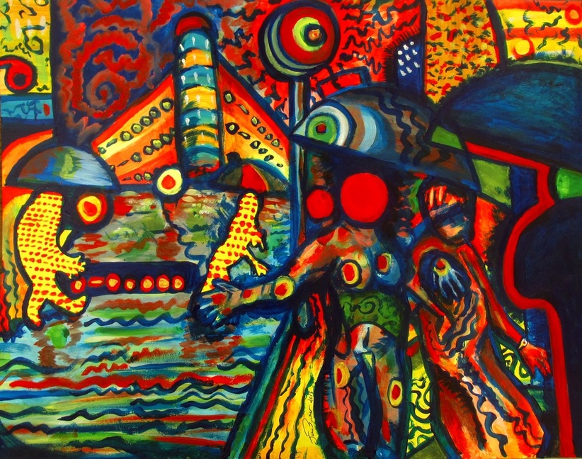
This project reinterpreted Gustav Cailbotte's Paris Street; Rainy Day, as pictured above, while retaining the umbrellas. The Art 21 theme used was "secrets", and the three creative strategies used were: coded communication, silhouettes of shapes, and expressive line. Overall, the painting has to do with lies, in this particular case, cheating. This piece, through working with it, has quickly become an emotional attachment to me. A lot of myself, specifically that of past relationships, is poured into this piece, but not explicitly. I wanted to make it as abstract and indirect as possible (while at the same time being aesthetically appealing) but just direct enough where someone can sort of get the idea as to what the figures were, humans/individuals and maybe a trace of its symbolism.
The coded communication, which is done in morse electric telegram messaging, reads "Lie" and is seen on the sides of the building in the distance as well as in red paint on the yellow figures, and also on the rectangular shape between them.
The silhouettes are of people, or other bodies. These represent association with the figure with the red dot for a head. In fact, the warm colors in this piece are of association with this figure. Notice the targets all over the figure's body and those colors' distribution throughout the painting.
Expressive line wasn't used primarily throughout the piece, but it's there. (I didn't fully read the criteria before I started the painting, so it was sort of implemented late into the process which is a fault on my part). The intentional expressive lines are the wavy ones, which represent uneasiness/disorientation. This again is symbolic, and all ties into to a specific idea within secrets.
I enjoyed this piece overall. Even though I made errors early in the work, It turned out to be one of my favorite pieces ever for me on a personal level, as a lot of my emotion was translated into this piece while still retaining the original paintings proportions and general placement.
Archives
October 2016
September 2016
August 2016
April 2016
March 2016
February 2016
January 2016
November 2015
October 2015
September 2015
Categories
All
1. Fundamentals Of Technique & Design
2. Productivity & Creative Experimentation
3. Personal And/or Cultural Identity
4. Critical Thinking & Ethical Behavior
5. Speaking
6. Art Historical Research
7. Senior Exhibition
Ceramics
Color Theory
Digital Media
Foundations
Graphic Design
Health & Safety
Liberal Arts
Painting & Drawing
Prints & Books
Professional Practices
Reading & Writing
Sculpture
 RSS Feed
