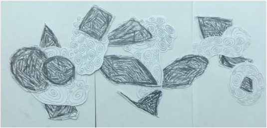
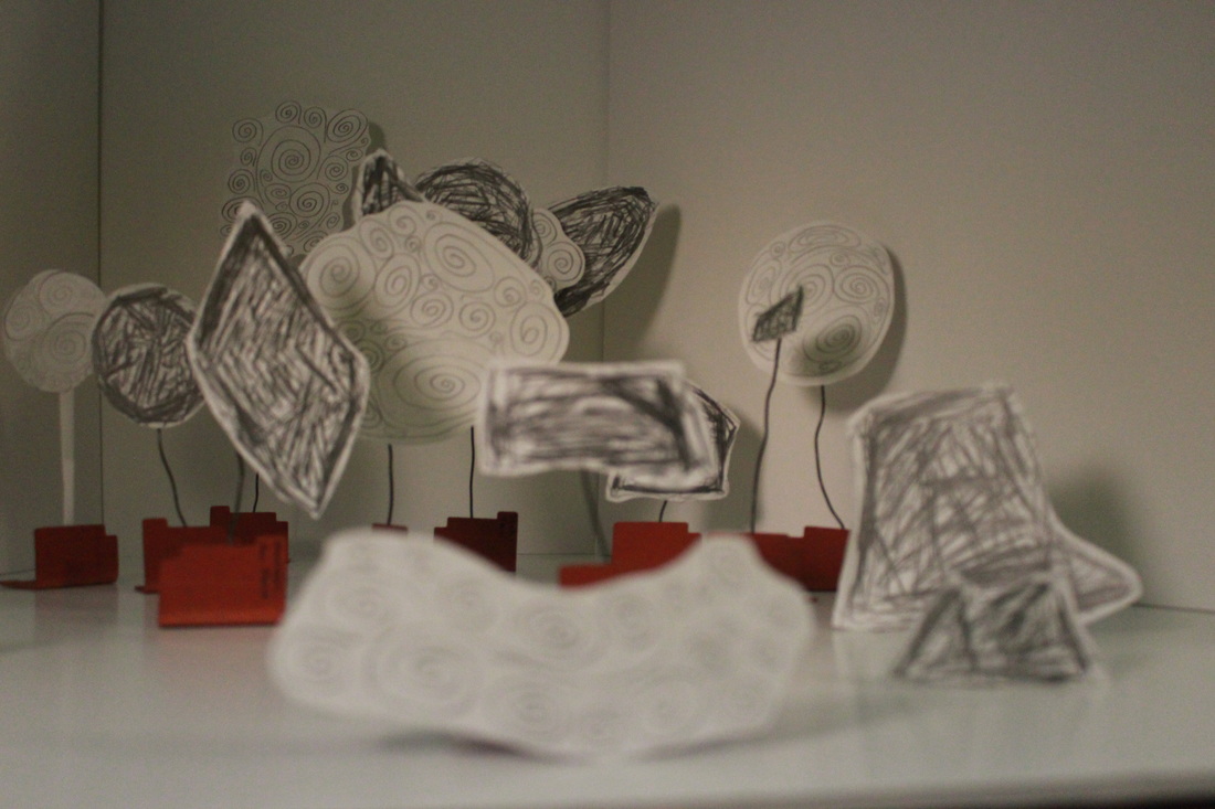
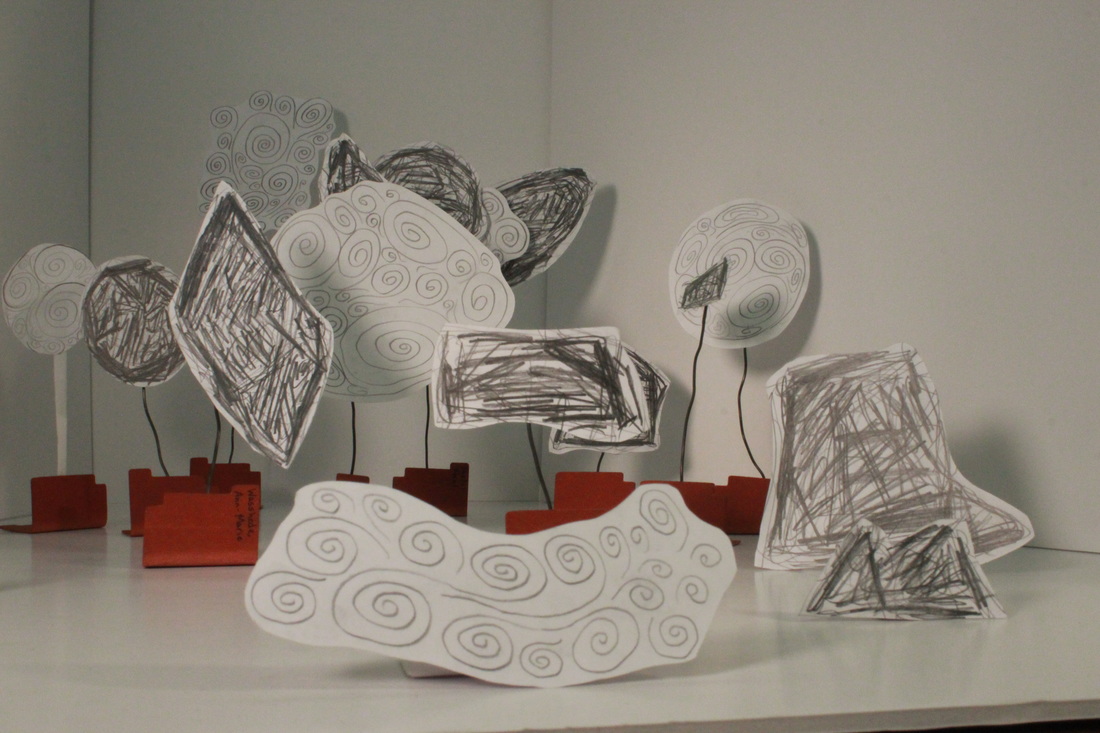
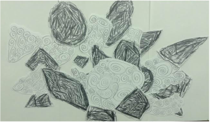
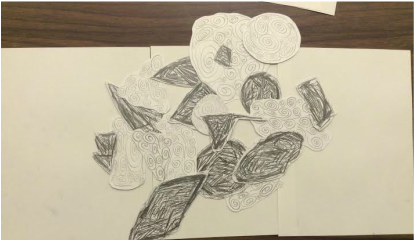
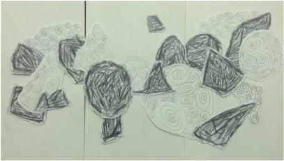
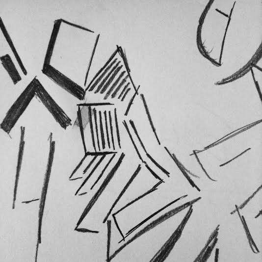
   I didn't grasp initially how the setup would actually be. I presumed that the card-stock cutouts would be elevated from a white support so there would be layering, so I arranged the 5 layout ideas in accordance to that idea. I didn't fully realize however how the layout would actually be, so the final product looks nothing like any of these layouts. Fault on my part for not paying keen attention.
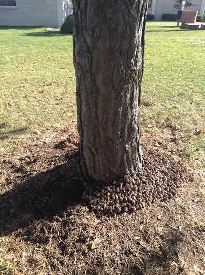
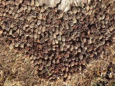
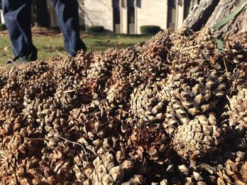
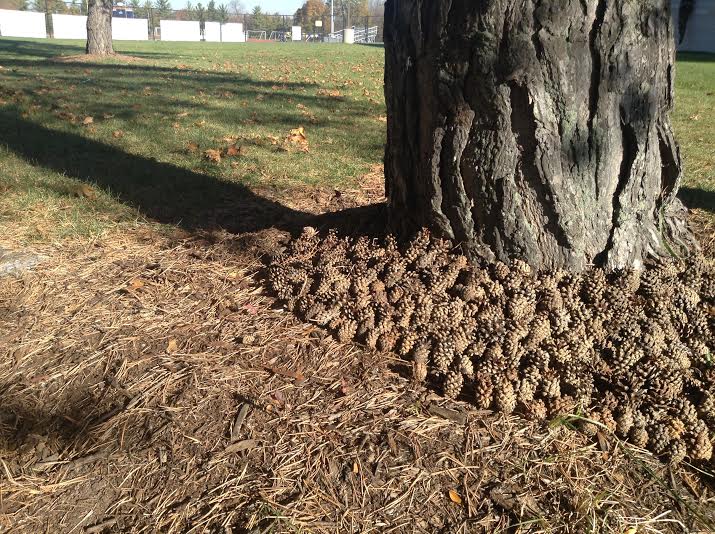 For this work inspired by Goldsworthy, my partner Theresa Balinski and I agreed to work with the light from the sun and how that could be used to produce interesting effects. We chose to use pine cones because of their diversity in size and more importantly the contrast of the in-and-out depths that make it up with the "wings" of their seeds. We get really great and stark contrast from it, and it looks interesting up close as well as from a difference. We also had pine cones that were closer to the trunk of the tree point towards the trunk itself, and these cones would also be similar in color to the tree bark. We decided not to include the shadow of the tree to have any pine cones so the idea of sunlight and shadows war further enhanced. It represented the idea of ephemera in that within an hour the shadow of the tree would have moved, breaking the structure of the piece.
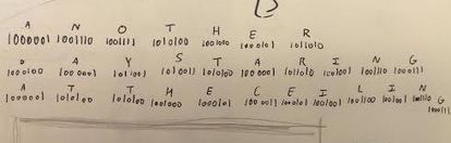
The lyric I used for this piece was "Another day staring at the ceiling", from Breathe by Telepopmusik (http://www.lyricsmania.com/breathe_lyrics_telepopmusik.html)
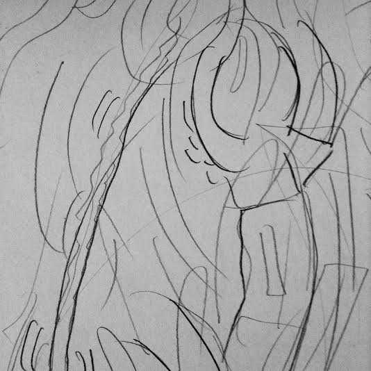
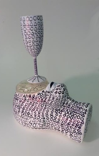
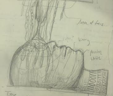
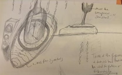
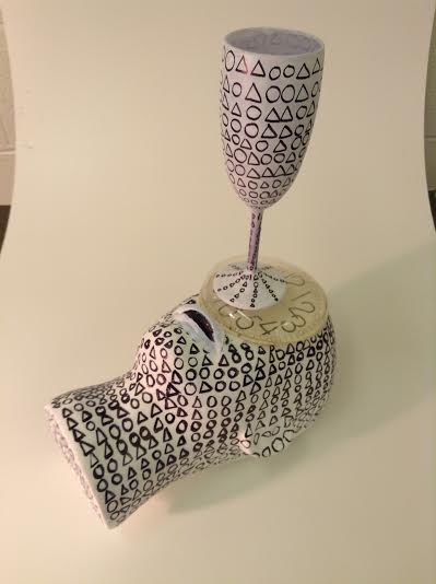
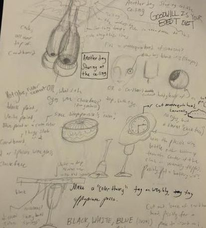
Originally,the design would have been more complicated, I forgot initially the the primary focus had to be on the symbols, in this case, binary (replacing 1 with a triangle, 0 with a circle), so I took away some of the complications so that the symbols/code acted as the complications, made so by the intricate contrast of the pattern covering the surface of the foam head and wine glass. This piece represents lying down, staring at the ceiling for an extended amount of time while affected by some sort of depressant, in this case, alcohol as represented by the wine glass. The glass also acts as the line of sight for this individual, staring upwards. The clockface replacing the eyes and nose represent the eyes themselves in a stationary position for an amount of time. I chose binary (replaced with shapes) so a more minimal approach was used, I didn't want over-complexity. The difference between the black sharpie and white head and glass were complex enough as mentioned above. I'm really fond of the surreal, especially in sculpture/model form in which they exist as dimensional objects, so I'm proud of the end result. The main difficulties were cutting the back of the head as an even (sort of) surface so it could lie on a surface. I only used an x-acto blade, so it took some time. Another issue that arose was gluing the wine glass to the clock-face, both plastic surfaces.
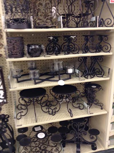
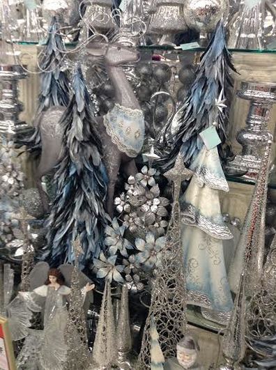
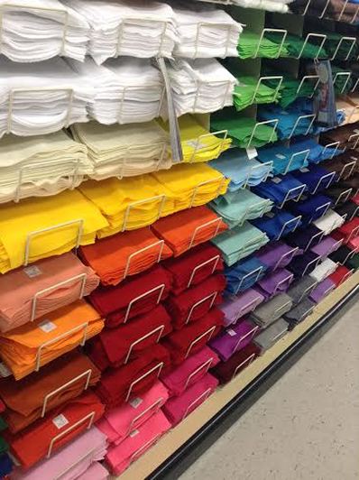
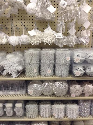
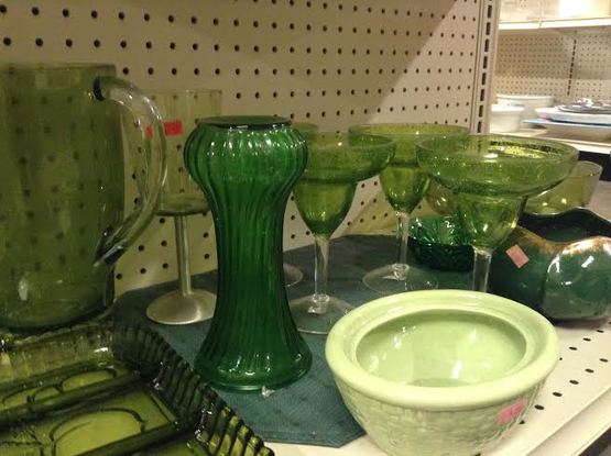 I took these pictures at Hobby Lobby and Goodwill. It wasn't too difficult finding these color schemes, I didn't actually have to arrange anything. Most of the arrangements were in a monochromatic scheme, especially at Hobby Lobby with their holiday arrangements. It was a fun experience going out and seeing how companies will arrange their objects by color to gain aesthetic appeal.
Elmer's No-Wrinkle Rubber Cement: http://elmers.com/docs/default-source/msds-sheets/me904-htm.htm
Sharpie King Size Permanent Marker: http://www.forestrysuppliers.com/Documents/656_msds.pdf Utrecht Studio Series Acrylic Paint: http://images.utrechtart.com/Content/MSDS/SSA.pdf Blick Artists Acrylic Paint: http://cdn.dick-blick.com/msds/DBH_SDS_00624XXXX.pdf Mont Marte Compressed Charcoal Sticks: http://www.montmarte.net/assets/Uploads/files/listing_1351_file_1308274983.pdf? 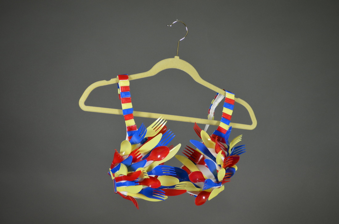 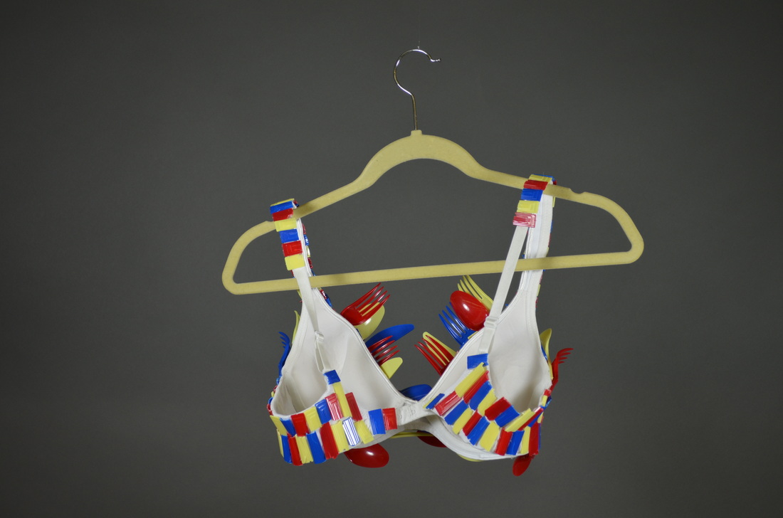
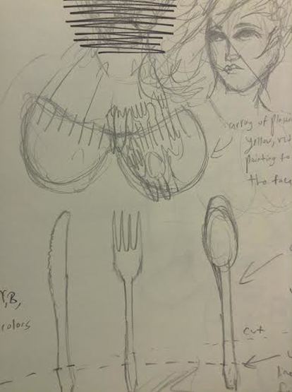
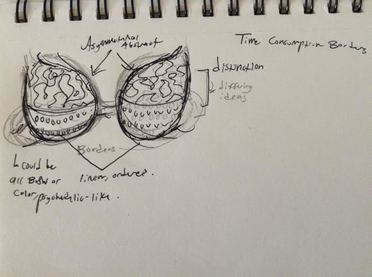
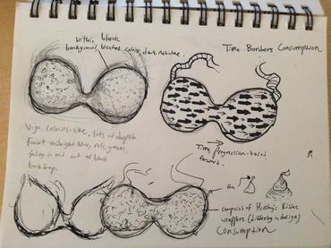
This bra represents an overall idea of consumption. This doesn’t exclusively include the consumption of food, but consuming of all types, media, gossip, etc., but in excessive amounts, represented by the many forks, spoons and knives.
With these colors being the primary colors, meaning that they can be mixed to form any other color, it represents that it covers the whole spectrum of personalities and people, that anyone can be an excessive consumer. The physical qualities of the bra, specifically the sharpness and jagged cuts, represents that the habit of over-consuming something may be harmful to some degree.
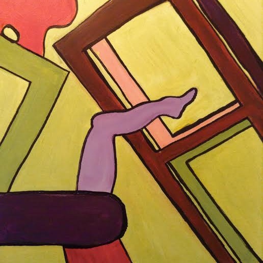
With the painting, I cropped out the area of the initial college that had at least one obscurity. I wanted to make sure the painting was as interesting if not more interesting than the collage. Using the triad color scheme (yellow-green, blue-violet, red-orange) was interesting. I've never been too fond of these colors being together, I wanted to pose a challenge for myself. Working with them by organizing and balancing their values, however, I found ways to make it all visually interesting, at least to me, and especially with the sharpie to really enclose the shapes.
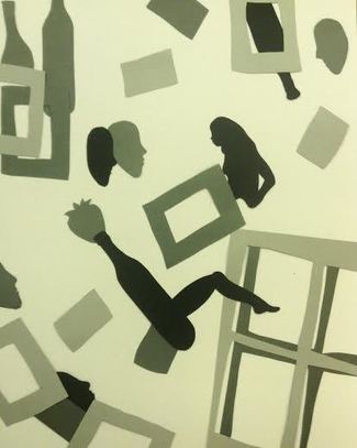
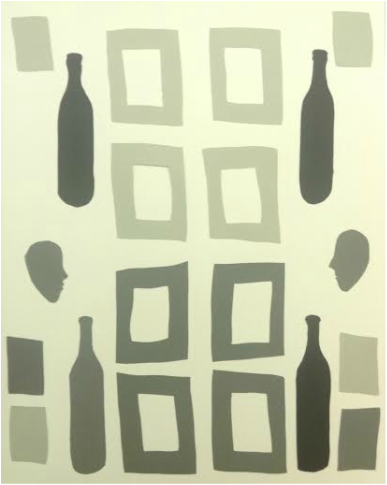
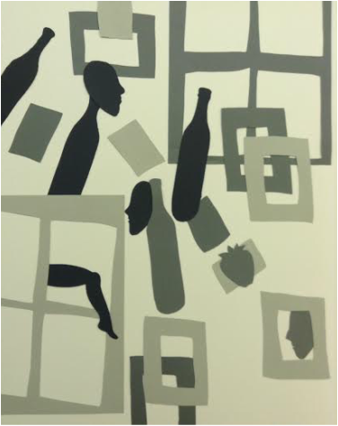
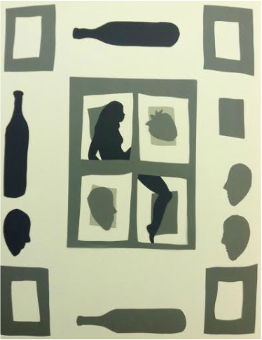
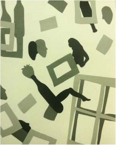
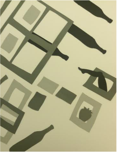
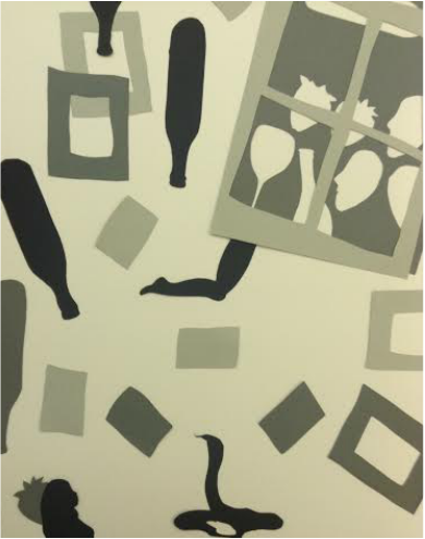
(2nd row on the right was my final choice) With this piece, I made sure to cut out many frame shapes so objects could layer on top and underneath these frames to give a further sense of depth alongside the already present differing values. The frames themselves act as the "border" side of this piece, alongside the faces on opposing sides looking at each other. The consumption is represented by wine bottles, the strawberry, and the consumers, the humans. I wanted to make this particular piece interesting even to those who don't grasp the overall, symbolic meaning, so I included the wine bottle with a leg to act as the focal point. It's surreal and bizarre, adding a touch of humor or individualistic style to the piece.
|
Archives
October 2016
Categories
All
|
 RSS Feed
