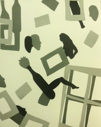
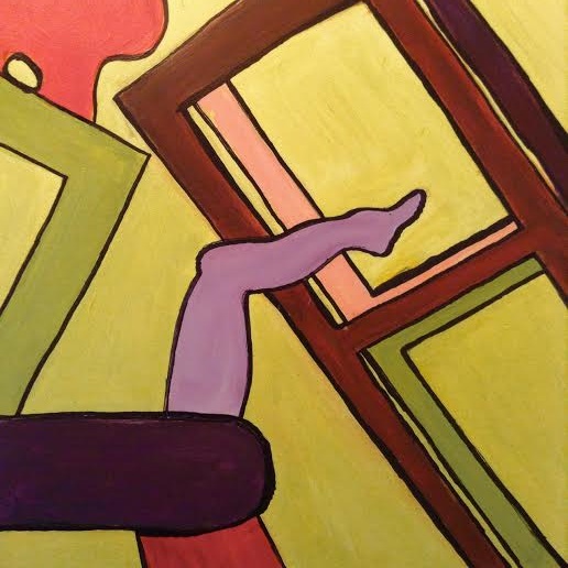
With the painting, I cropped out the area of the initial college that had at least one obscurity. I wanted to make sure the painting was as interesting if not more interesting than the collage. Using the triad color scheme (yellow-green, blue-violet, red-orange) was interesting. I've never been too fond of these colors being together, I wanted to pose a challenge for myself. Working with them by organizing and balancing their values, however, I found ways to make it all visually interesting, at least to me, and especially with the sharpie to really enclose the shapes.
Leave a Reply. |
Archives
October 2016
Categories
All
|
 RSS Feed
