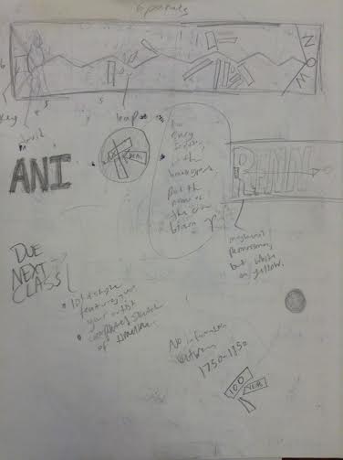
Solvent Transfer Montages on the Taoist theme of Wu Xing and in the style of Robert Rauschenberg3/28/2016 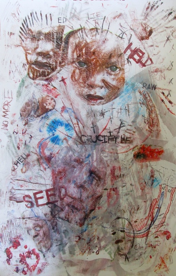 Final. I wanted this to stand as a powerful, unnerving, and mesmerizing piece. The viewer's eyes quickly go to that of the child, with a distressed look on it's face, with the words "CRUCIFY ME" right below them, and other words scattered throughout. One may also feel some sort of sympathy or guilt, it's definitely has implied emotion. I decided to take advantage of the color in some of my prints to distribute throughout the piece as well as write words, such as "HELP" and "HELL" seen throughout the composition. There is also an "X" and cross element that is seen throughout the composition to reinforce the "CRUCIFY ME" and to further add to a sensation of morbidness or uneasiness. Gestural strokes were used instead of transferring entire images, as seen with the African youth. This is to not only add balance with the dark and ground, but to strengthen the emotion in that child's eyes. The haphazard and bold gestural strokes are also consistent throughout the piece, with these strokes in particular being some of the darkest and most prominent. I did transfer entirely, however, elements found in the prints, such as the child's eyes and mouth, same goes for the image I have for "tears" at the bottom of the piece where we see a disturbing image of a distressed face with just eyes and mouth. Overall I am very proud of the outcome. 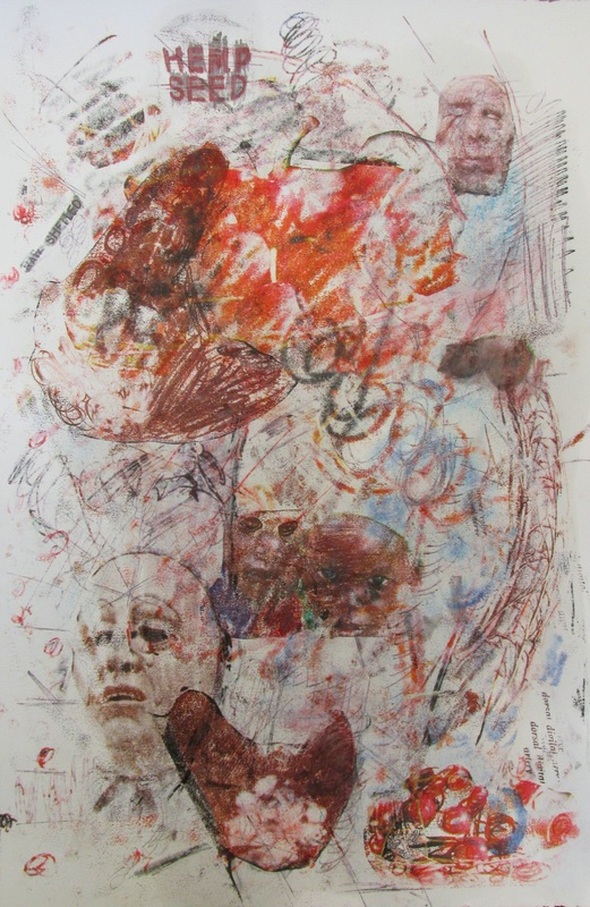 First part. Below are the images used for this project. (link to source in each picture's caption)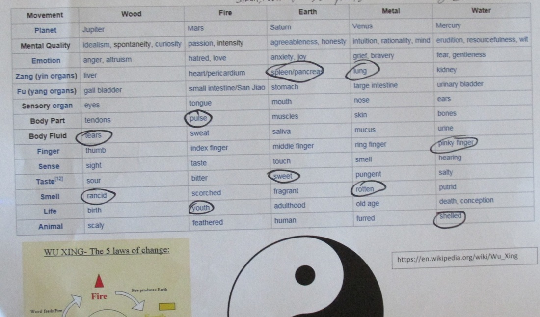 
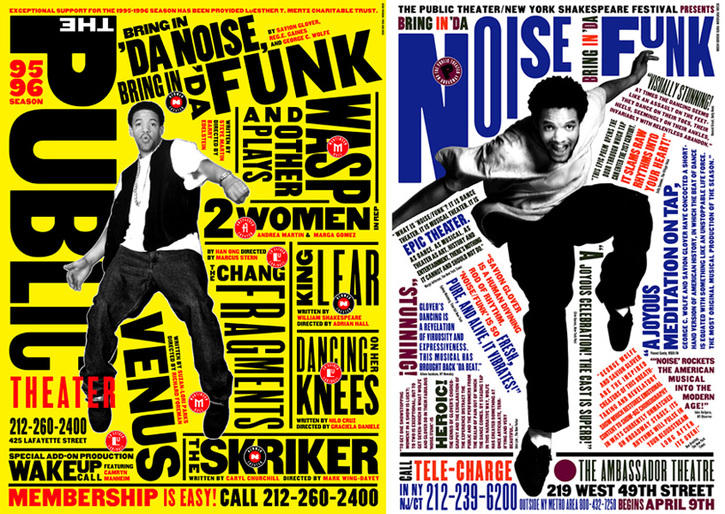 Paula Scher's Work
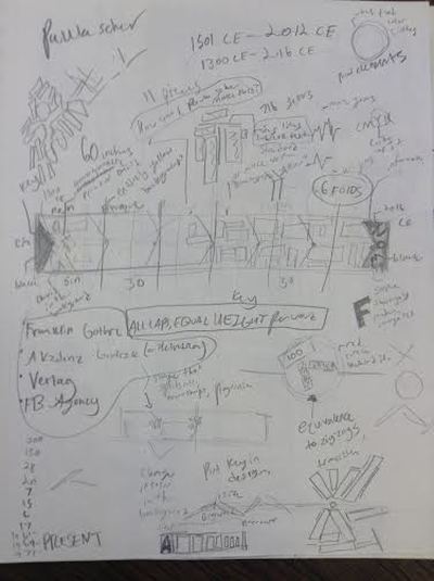
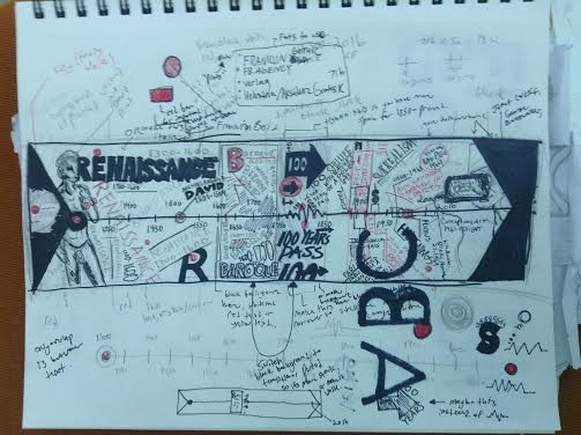 Initial sketch as to what the general layout would be. This is where I put the bulk of my ideas and motifs seen in Scher's work that I would later replicate (or try to). I have also added my own touch to the work. At the beginning and end of the timeline are full black triangles. Scher never used these, but I felt the full black color and simple geometric shape would accentuate Scher's use of black lines as well as the text she would use at an angle. 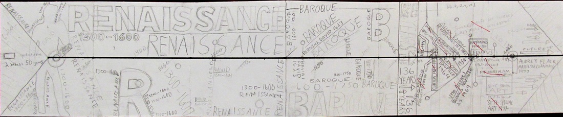 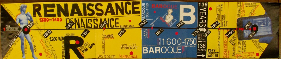 The finished product. Slightly sloppy, but overall I'm pretty proud of it. This project was definitely one of the more challenging projects I've done over the course of my freshman year here at Siena, but it has also been one of the most beneficial, as it is comprised of different materials and, during the process, I was able to utilize techniques and tools I haven't used previously in projects, such as printing out color to glue down with PVA glue (The yellow background), as well as using the Color Aid paper. I'm overall pretty satisfied with the end result. I really liked how Scher used 1 color prints of figures and then arranged and portrayed the text in such a way that it accentuated the motion of gesture of the figure, and has strengthened my love and admiration for typography (a class I am taking during this time).
Originally, I only wanted to use the prints of Michaelangelo's David and the iPhone from Janet Cardiff's et al.'s in the design, but I felt the distance between those two points would feel bland, even with all the text and design elements. So, in the Baroque period I used Bernini's David as a sort of relief and to balance the composition. While on the topic of the Baroque period, I decided to make the background blue for numerous reasons: to make the whole composition more visually dynamic and interesting, to balance the composition, and to accentuate the duration of the Baroque period itself, as It is the second to longest period. It also felt to be just the right size in terms of adding that shade of blue to all of the yellow. When trying to represent Scher's work, I put a heavy emphasis on the minor details, as those details are what really define her work as her own. This is achieved through use of the red Color Aid cutout circles I've used, a motif seen in her work, as well as an an emphasis on directional text that suggests a sense of movement. This is achieved throughout the timeline with not only the text around the figures, but with the years on the timeline itself, as they are diagonal, and this further accentuated by the diagonal shape of the triangles and text that is diagonal throughout the piece. The only thing I would change would be to add just a bit more text to the Renaissance side. There seems to be too much yellow/negative space, and I would have liked to have some thinner text, probably in FB Agency, distributed in some sections of that time-span, but overall the composition feels balanced and interesting, and a satisfactory homage to Scher's style. |
Archives
October 2016
Categories
All
|
 RSS Feed
